
Vertbase.
Buy, sell and accept digital assets.
Published in 2019
Strategy
Product Definition
Product Management
Project Management
Interface Design
User Testing
Design System
Front-end Development
Back-end Development
Services
Website
Web App
custom CMS
Deliverables
Team involved
With Vertbase's simple and secure process, users can buy and sell digital assets in USD, GBP, or Euro. Order prices are locked in at the time of placement, and their non-custodial approach allows for complete control of the user's assets.

Defining Structure.
The skeleton behind the pretty face. The structure and strategy of how we helped to sell Vertbase's killer product. Although very familiar at its core, with the landing page redirecting the user to more in-depth pages of each feature, we had to get more creative inside each of these. With the visual aid of illustration and by playing with different grid alignments, we could create distinctive pages that shine on their own and keep the user engaged throughout the process.

Selecting Typography.
Once the structure is set in stone, we begin by trying out a few fonts that can really help set the tone for the entire website. We opted for Tiempos, a serif font that is strong in personality but delicate enough to give Vertbase a modern yet professional look.

Brownish Purple Rain.
By looking at the tough competition of the cryptocurrency world, we decided that the best way to fit in was to stand out. The most immediate solution was through a distinctive colour palette that relies on the power of a vibrant purple coexisting with a pastel palette of pale browns. Exciting and soothing in equal measure.

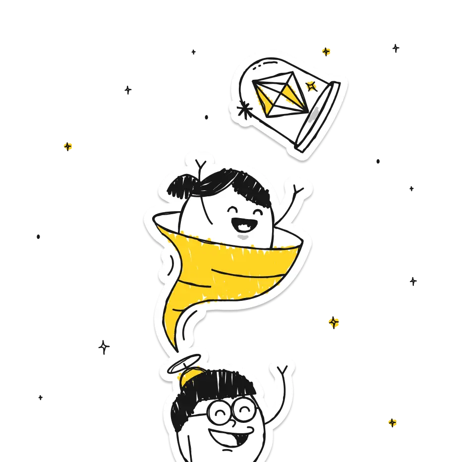
Illustration Style.
The world of cryptocurrencies is 100% digital. However, it carries on its origin a long history of people dealing with money manually, face-to-face, from one person to the next. A more personal, warm and meaningful experience that contrasts with the cold reality of dealing with the crypto world.

With that spirit in mind, it was almost automatic to go for a more brute, rough and manual style, with the use of hands to represent those personal transactions the user will undertake with the Vertbase app.

Icon set.
With such a specific illustration style, it would be hard for Vertbase's icon family to look any different. With its adventurous style, they sometimes lean towards a more abstract representation that relies on text as its partner in crime to really nail the message.


Animation.
By adding movement to some of the website’s main illustrations, we added an extra layer of meaning that elevates its potential in our battle to deliver the right message.
The Website.
By combining all of the elements listed above as ingredients of a very tasty recipe, the end result can only be just breathtaking. Pretentious? Well, the author of this text was not the designer involved.

We decided to treat each page with the same love and care, resulting in a set of pages that feel unique on their own but come together as one very cohesive and familiar ecosystem.


The Grid.
Although invisible to the user's eye, the grid plays a significant role in how we organise the information on every website we design. This is even more apparent on Vertbase's website as it not only helps with text hierarchy but also greatly influences the website’s look and feel.

Mobile Version.
With people always on the run, connected to their phones and tablets, we adapted the Verbase experience for the on-the-go, ensuring that it not only looks great on the small screen but also works seamlessly.

What are you looking for?
Please choose an option below
